Tuesday, 26 April 2011

DVD Cover design elements


When designing the cover art for this picture I had several things in mind when it came to inserting the text into the page. Looking at the left side of the image you can see the product description I put in which has a small red border around it.

As somebody who has pretty poor eyesight I made sure that it would stick out and be readable to most people, so I made the text quite large at what I believe is 14PT size font with a lot of space in between the lines as to make it more readable.

I also aligned the text in the centre as the design for the back of the box art is very centre aligned, as the pictures are in the center of the image too.

The only text that isn't centre aligned is the list of system requirements at the bottom as I wanted this to be easier to read and not to stick out amongst the rest of the text. Plus lists are quite hard to read if they aren't aligned to the left side.

The border that surrounds the images is not designed in quark, it is designed in Photoshop Elements instead as it was not possible to achieve the same effect. To do this I had to make sure that the text was the right size which required a lot of editing. Luckily Photoshop Elements has a tool to allow you to easily design borders.

With optical balance in mind you can easily see that the design is asymmetrical as the design is completely different on both sides and are not balanced, but this is difficult to achieve on a box art. Through optical balance I could also make sure that the first thing the reader sees is the massive zombie on the front of the box art, and when they look at the back they see the description of the game and the pictures.

Magazine design (the second coming)

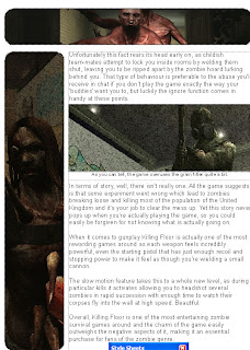
When designing the layout for my review I kept several things in mind when inserting pictures into it, such as making the pictures and text close together so they appeared linked together, or anchored.
Click to enlarge
As you can see in my review design all of the images are placed closely to the text so they have a close proximity to one another, making it so that they are clearly linked and associated with one another, being easier to read.

You can also see that the text is aligned to the left which makes it so that the text is easy to read and absorb the information, rather than going for something bold and different by going centre or right aligned which would have made it an eyesore for a review.

When keeping optical balance in mind you can see the picture in the middle of the page is just above the middle of the page which keeps it in optical balance for that page.


Now if you look at the design from both pages you can see that there are three images that capture your attention in the middle, one being the soldier pointing the gun, but this is balanced by the image to the top right and to the right. There are also other lighter images on the pages to help balance the heavy picture out such as the image to the top left and the image in the center of the review on the second page.

When designing images for the page I wanted to go for a simplistic look which is shown in this image that I use on the top left of the page, it highlights the name of the title and what platforms the product is being released for, with a little bit of transparency on the patriarch zombie at the top so that it sticks out from the rest of the image and seems he is 'popping' out. To get this image I took the screenshot myself when actually playing the game.

To edit the image I used photoshop which allowed me to use transparency to make him stick out, I also used other features such as the gradient to make it so that it has a gradient going from red to black from the top to bottom of the image.

Another minor detail was the black border I added which has the effect of making it stick out from a page that has a white background, drawing the eye to it and the detail included in it.

This image took several different layers to achieve as the zombie is on the topmost layer making it so that it sticks out above the rest of the image, whilst the text is on another layer and the background on another layer.


This is another image I took when in-game using the spectator mode, which allows you to follow the player around and watch him battle zombies, so I took a picture of him with a grenade launcher ready to fire at some zombies.

With this image I only edited it a small amount in Photoshop Elements as it did not require much editing, though the image was incredibly dark making it hard to see exactly what was going on, so I used the brightness and contrast tool to make it a lot easier to see. I edited the image further in quark by giving it a rounded border, this way the image sticks out from the page and looks a bit more modern,

Professional comparison


When looking at the professional box art we can see a big difference when compared to my design. The first is that the colour scheme is different as the professional design has a very rusty look as though it is in an industrial sector.

Not only that, but there are also minor details that are different such as the quote on the bottom of the image, I do not have a quote from a review site on the bottom of my cover and nor do I have the Tripwire logo on the front, only putting it on the side instead as I could not find a high resolution image with transparency to use.

The rating logo is also different as I used a PEGI.info rating instead of using the BBFC logo, as PEGI has taken over most of the ratings in the game industry.

Unfortunately I cannot compare the backs because as much as I search I cannot find a picture of the back of the professional box art.

Wednesday, 30 March 2011

White space in terms of my final product

Click to enlarge - The areas highlighted in pink are the areas I utilized macro whitespace in my design
For my design I conscientiously used macro whitespace to make sure that certain elements of my design were in the centre and drew attention to themselves. For example you can see the Killing Floor title on the right side of the image has white space to the left and the right of it, making it stand out from the background and makes it the item you notice first.

The white space on the left side of the image it utilized in a way that draws attention to the text and makes sure that it is easy to read and in a compact space, making sure that the relevant information is displayed.

Review design

Click to enlarge
When designing my review I was originally going to go with one page, but due to the length of the review and my stubbornness I decided to just make it two pages instead, but this actually worked in my favour as it allowed me to put a few more pictures in and make the design more interesting, which I hope worked.

I decided that I needed to utilize whitespace in order to make my review readable and interesting to look at, so I made sure to keep a lot of Macro whitespace at the top and the bottom so that the review looks quite compact and ensures that when printing it, nothing will get cut off.

I also utilized micro whitespace with the spaces between the pictures and the text so that the pictures and the text will be much easier on the eye to read.

After I set up the text layout I decided to add the pictures and did not want boring rectangular pictures so I decided to use a different frame to give it a different look, which I believe worked well.

Tuesday, 22 March 2011

Logo design 2

As I wanted to have a bloody design for my background and I could not use a transparent background as Quark does not support transparency, I had to make it so that the blood stains on the font matched the blood stains on the zombie itself, so the background would align.

Here is an example: 

As you can see the background does not match up, so I had to make sure that it was aligned exactly, quite an annoying process to get right!

Killing Floor Logo

When designing the Killing Floor logo I decided to go for a new approach instead of copying the logo already used for the game, visible here:

As you can see it looks bloody and as though it is sort of covered in barbed wire with blood dripping off of it, whilst I recreated the general theme I came up with a completely logo different altogether, but a basic one

Click for bigger size
  I simply downloaded a font from Blambot.com, a popular website for free comic book fonts and added a stroke effect of 2px in photoshop, generating the effect shown here.